Anonymous 9757

Running `pdflatex` on
```latex
\documentclass{article}
\pagestyle{empty}
\begin{document}
\(\frac{m}{n}\)
\end{document}
```
yields
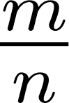
Why so much vertical space between the bar and *n*? If there are no other fractions around in the same line, there's no good reason for this gap from the viewpoint of a reader.
Is there a version of `\frac` such that `\frac{m}{n}` produces less space between the bar and *n*, ideally the same space as between *m* and the bar? (Though you could say `\(\frac{m}{\raisebox{.4ex}{$\scriptstyle n$}}\)`, the number .4ex would be ad hoc, and the whole construction would be cumbersome.)
Top Answer
barbara beeton

As pointed out in the comments, the technical answer is given in Appendix G of the TeXbook.  But an answer understandable by ordinary humans is wanted.

Also pointed out in the comments is that the baseline of the denominator is set so that all denominators will be positioned on the same baseline, and *k* requires more space than *m*.  Positioning each denominator according to its own shape would look very raggedy when multiple fractions occur in the same text.  TeX considers each element (e.g., a fraction) individually unless instructed explicitly to do otherwise, and it doesn't "back up".  TeX was created to typeset documents containing a lot of math, and uniformity was an important consideration.  Requiring an author to pay attention to the position of denominators would be counter-productive.

A different choice was made in the case of subscripts, where it was considered that expressions with both a tall subscript and a deep superscript were not so frequent that the subscript should always be set lower, potentially forcing baselines of text blocks with inline math farther apart.  So in practice, when this positioning *does* occur, a question similar to this one is raised.  And the answer is that either manual adjustments must be made, or the positioning attribute that is stored in the font's .tfm file can be reset.

The vertical positioning of a denominator is also defined by a value in the .tfm file, and it can be reset.  For a document with only one fraction, that can be done in the preamble.  If there are multiple fractions with mixed-height denominators, a different fraction command can be defined to change the relevant font attribute so that it is properly scoped.  But it will still be necessary to make a conscious choice of which command to use.

This is probably different for OpenType fonts; I don't know how those are handled.