JeT

**Context**
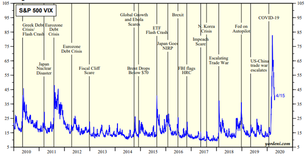
Time series are boring to read without labels...
**My question**
I'd like to have a systematic approach to comment upon a Time serie, as in this :
- 1 table to load `VIX.dat`
- 1 table with dates of interest I'd like to flag `mydates.dat`.
**M(not so well)WE**
Based on this [for the metadata in label](https://tex.stackexchange.com/questions/258194/pgfplots-pointwise-positioning-of-explicit-point-meta)
and [this for the vertical line](https://tex.stackexchange.com/questions/56896/vertical-line-in-ymode-log-plot)
```
\documentclass{standalone}
\usepackage{pgfplots}
\usepackage{pgfplotstable}
\usepgfplotslibrary{dateplot}
\pgfplotsset{compat=1.8}
%\definecolor{myuniversity}{RGB}{59, 33, 130}
\begin{filecontents*}[overwrite]{VIX.dat}
date variable
%Delete
2021-04-23 18.50
2021-04-22 18.71
2021-04-21 17.50
2021-04-20 18.68
2021-04-19 17.29
2021-04-16 16.25
2021-04-15 16.57
2021-04-14 16.99
2021-04-13 16.65
2021-04-12 16.91
2021-04-09 16.69
2021-04-08 16.95
2021-04-07 17.16
2021-04-06 18.12
2021-04-05 17.91
2021-04-01 17.33
2021-03-31 19.40
2021-03-30 19.61
2021-03-29 20.74
2021-03-26 18.86
2021-03-25 19.81
2021-03-24 21.20
2021-03-23 20.30
2021-03-22 18.88
2021-03-19 20.95
2021-03-18 21.58
2021-03-17 19.23
2021-03-16 19.79
2021-03-15 20.03
2021-03-12 20.69
2021-03-11 21.91
2021-03-10 22.56
2021-03-09 24.03
2021-03-08 25.47
2021-03-05 24.66
2021-03-04 28.57
2021-03-03 26.67
2021-03-02 24.10
2021-03-01 23.35
2021-02-26 27.95
2021-02-25 28.89
2021-02-24 21.34
2021-02-23 23.11
2021-02-22 23.45
2021-02-19 22.05
2021-02-18 22.49
2021-02-17 21.50
2021-02-16 21.46
2021-02-12 19.97
2021-02-11 21.25
2021-02-10 21.99
2021-02-09 21.63
2021-02-08 21.24
2021-02-05 20.87
2021-02-04 21.77
2021-02-03 22.91
2021-02-02 25.56
2021-02-01 30.24
2021-01-29 33.09
2021-01-28 30.21
2021-01-27 37.21
2021-01-26 23.02
2021-01-25 23.19
2021-01-22 21.91
2021-01-21 21.32
2021-01-20 21.58
2021-01-19 23.24
2021-01-15 24.34
2021-01-14 23.25
2021-01-13 22.21
2021-01-12 23.33
2021-01-11 24.08
2021-01-08 21.56
2021-01-07 22.37
2021-01-06 25.07
2021-01-05 25.34
2021-01-04 26.97
2020-12-31 22.75
2020-12-30 22.77
2020-12-29 23.08
2020-12-28 21.70
2020-12-24 21.53
2020-12-23 23.31
\end{filecontents*}
\begin{filecontents*}[overwrite]{mydates.dat}
date Label position
2021-02-24 {It was a good day} 0.5 % as in `[pos=0.5]`
2021-01-10 {Market's hangover} 0.5
2020-12-31 {Happy new year} 0.3
2020-12-24 {Merry Xmas} 0.7
\end{filecontents*}
\begin{document}
\begin{tikzpicture}%[width=20cm,height=8cm]
\begin{axis}[
date coordinates in=x,
date ZERO=2020-12-23,
xticklabel=\month-\day, %\year,
xticklabel style={rotate=90},
enlarge x limits=false,
ymin=0,
xmin=2020-12-23, %date ZERO
xmax=2021-03-24,
]
%The time serie
\addplot[smooth,no markers] table [x=date,y=variable] {VIX.dat};
%The dates where I need a vertical line + label
% So far I just have the label
% The vertical line shoule be based on date in mydates.dat
% no rendering so far.
\addplot[
line width=1pt,
mark=*,
x=date,
y=Label,
nodes near coords,
point meta=explicit symbolic,
visualization depends on={value \thisrow{position}\as\mypos},
every node near coord/.append style={font=\small,pos=\mypos}
] table [meta=Label] {mydates.dat};
%\draw ({axis cs:date,0}|-{rel axis cs:0,1}) -- ({axis cs:1.2,0}|-{rel axis cs:0,0});
\end{axis}
\end{tikzpicture}
\end{document}
```