Pax

This is a proposal for the home page design
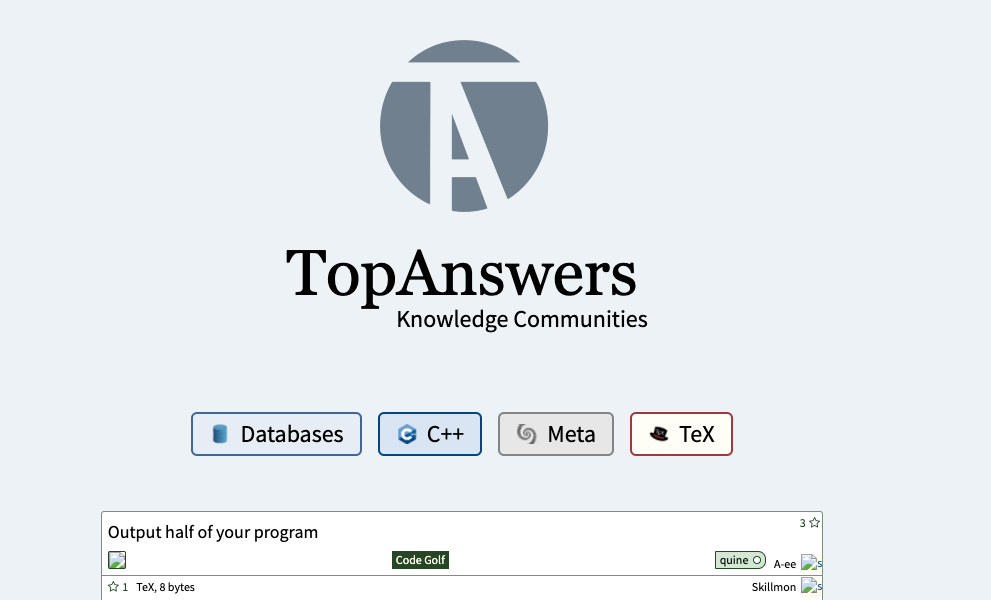
* "TopAnswers" (site title) be in a serif font.
* 💡 Making it a serif font sets it apart to the rest of the text which is a sans serif font
* Lighten the background color from lightgrey (#d3d3d3) to lighter bluegrey (#edf2f7)
* Remove "boxiness"
* Remove white boxes at the top section
* Remove white box at the bottom section and make the section "full width" but the text still in a centered container
* Remove borders of codidact community logos
* Make the width of the list of communities, the q&a list, and the bottom white section's text be the same.
* Remove underline of links and change colour to a softer blue (#0a529e)
Top Answer
Pax
# Proposed
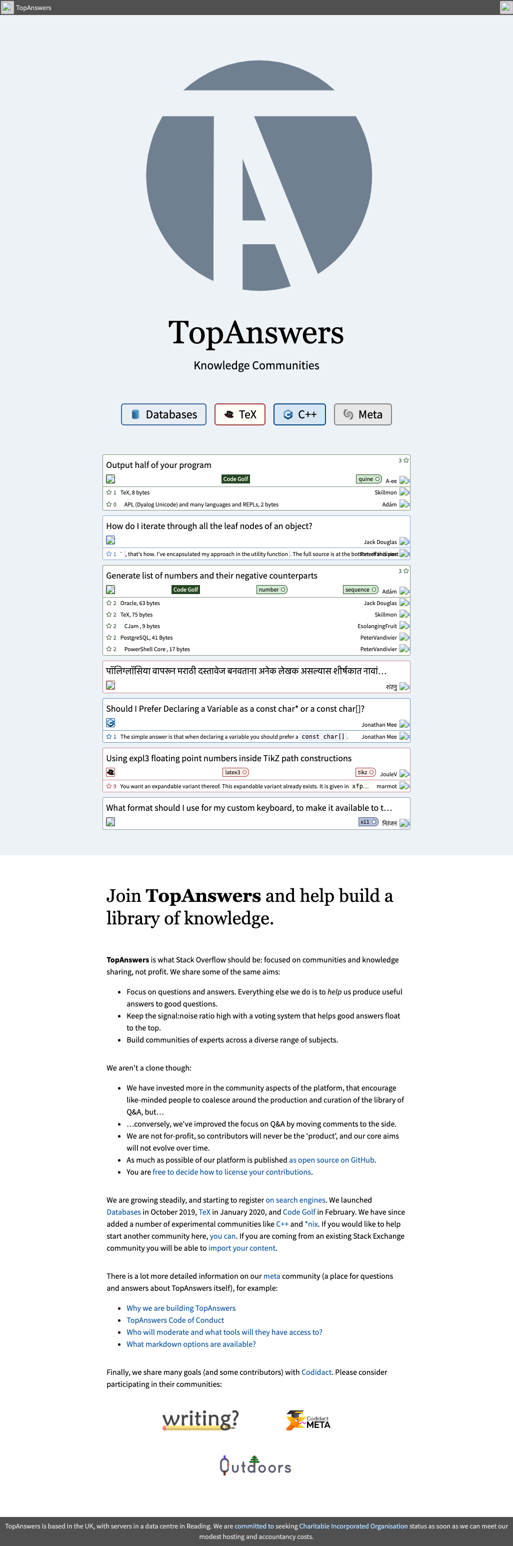
I actually would like the bottom padding of the "lightbluegrey" box and top padding of the "white" box to be the same height as the top padding (the distance from the edge of the header to the edge of the logo)
If a screenshot of such change is requested and I have time, I would update this post.
## Smaller Logo
Answer #2
Pax
# Current Home Page