Adám

This is a proposal for the general design — not for the particular colour schemes. There is [a separate request for a dark scheme](https://topanswers.xyz/meta?q=745). * Model the right hand pane (chat) after the left (posts): * Move the bottom "room bar" <header>) to the very top to align with and visually extend the top bar (<header>). * Give the icon on the left a drop-down room selector (just like the site selector). * Give it a search field (which as opposed to the main search, only searches when you press Enter, and then takes you to a transcript search). * Move the starred and transcript links into the chat top bar. * Move the room title down below the input field * Put the active chat users after the room title * Actives' bar: * Move #active-users to the bottom below the chat input field. * Extend #active-rooms to the full height. * Top bar: * Make the search field take up all available space. * Move profile button to bottom right corner, where chat users and active rooms meet. * Everywhere: * Remove unnecessary borders. * Remove background contrasts. * Increase text-to-background contrast * Breathe! --- ## Comparison Click on an image to enlarge it, then use the `<` and `>` buttons to switch images and compare! The first image is the current situation: 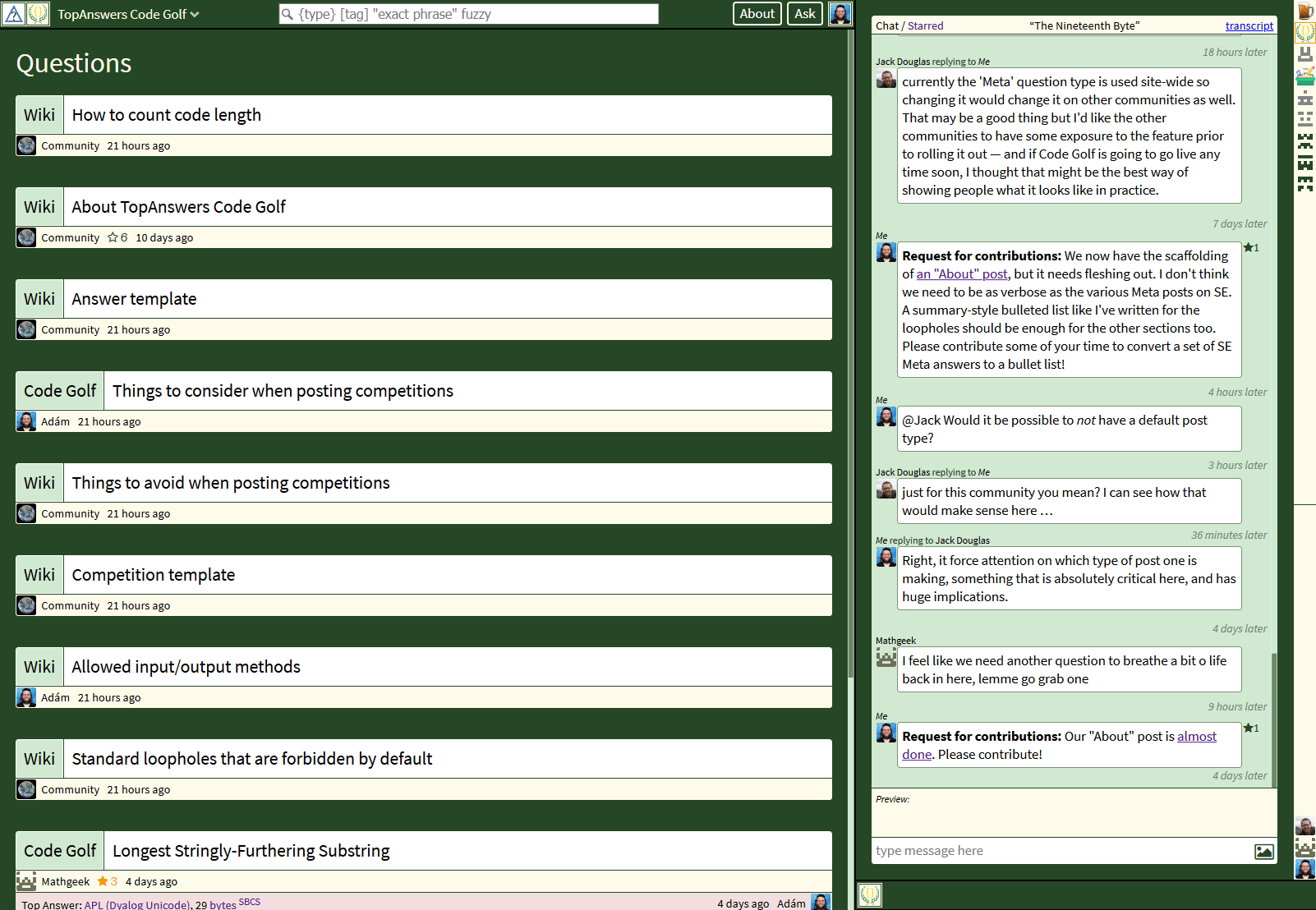 This is the current layout, but with light backgrounds, as mocked up by Jack: 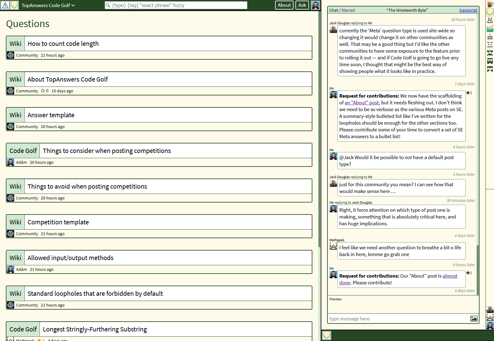 Finally, my proposal: