xnor

I have some comments about bits where I found the UI to be unintuitive or unnatural. I'm using a laptop (1920x1080).

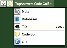
Often I'm browsing a question and want to return to view other questions on the site. Currently, this can be done with the "TopAnswers" link at the top left, but I'd expect that to go to a general main page. It would be nice if the site name under it linked to its question page. I also expected that re-selecting the current site from the dropdown would take me to its question page, but it just leaves me on the question.

With one answer here, it looks like Adám was the one who posted the answer, because his name and icon are immediately above it. The name and icon of the actual answerer Skillmon are all the way to the right, where they are easy to miss.

It took me surprisingly long to find the "submit" button for my first post. It seems to be hidden among drop-downs that looks kind-of similar to it. I also expected it to be at the bottom below the edit window, continuing the downward flow when typing out an answer.

The license link is much too prominent here, with the hyperlink color and underline making it stand out more than the poster and date.

I think the time of the post should appear without mouseover. The "X minutes later" often doesn't help with this because I don't know that message was posted either.
Top Answer
James Douglas

> Often I'm browsing a question and want to return to view other questions on the site. Currently, this can be done with the "TopAnswers" link at the top left, but I'd expect that to go to a general main page. It would be nice if the site name under it linked to its question page. I also expected that re-selecting the current site from the dropdown would take me to its question page, but it just leaves me on the question.

^^^ The site switcher was updated recently, and you can now select the community you are already on (and also open a community in a new tab)
@@@ answer 842
Additionally, the site icon next to the site switcher links back to the community homepage.
> The license link is much too prominent here, with the hyperlink color and underline making it stand out more than the poster and date.
Licenses have now been moved under a "license" link on the bottom bar alongside the "edit" and "comment" links:

And when you click on it, it is replaced with the real license link(s):

---
and finally:
> It took me surprisingly long to find the "submit" button for my first post. It seems to be hidden among drop-downs that looks kind-of similar to it. I also expected it to be at the bottom below the edit window, continuing the downward flow when typing out an answer.
The license controls are now also hidden by default and shown on demand:

Answer #2
Adám

## Cleaner and more consistent post meta info
### Main post listing
Currently:

I suggest making the white OP bar a tad taller so the right side can fit two lines containing the authorship and star info, identical to that of the answer listing; and the tags (if any). This also allows us to get rid of the "Answer:" label which serves no real purpose, and eats up precious horizontal space on narrow screens:
Mock-up:

### The page for a post and its answers
Currently:

The OP bar should match the layout and styling of the answer bars:
