Monica

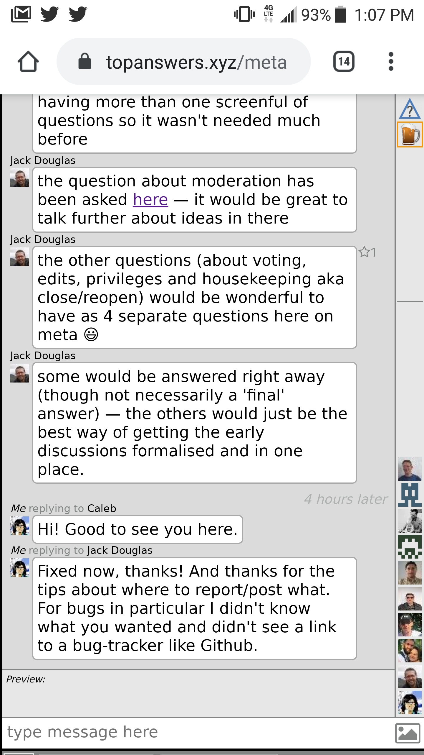
After creating an account here I tried it out on my phone (which, for SE, I use(d) to monitor activity, particularly as a moderator). This is what I see when I visit meta on my Android phone using Chrome:

It took me a lot of poking around to (somehow; I'm not sure how to reproduce) get to a view that had a "questions" button at the bottom, at which point I could get to the questions list. But if I view a question and then try to get back to the question list, I end up back at chat again instead and I'm back to figuring out how to get out.
I don't know a lot about front-end stuff, but I'm guessing/hoping that each section on the site has something akin to a Z-order (a priority), and chat is currently priortized higher, and prioritizing the other part (left pane on desktop) would fix it. But that's a lot of guessing and I don't know what it would break, so maybe that's not the answer.
Could we do *something* to make a mobile view non-painful? I'm not suggesting we invest heavily in making it great, just asking if we can make it primarily about Q&A instead of chat.
Top Answer
Jack Douglas

There is a lot more to do here, and we really haven't started on the mobile experience yet, but we have made a few cursory changes along the lines you suggest:

* The questions pane is now the default, until you switch to the chat pane and then your last setting is remembered

* We've added some padding on the bottom of the chat pane. This is ugly and still problematic, but slightly better than having crucial navigation elements hidden below the iOS nav bar