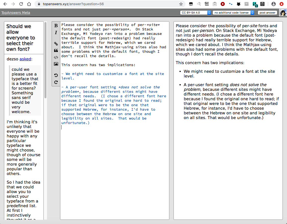
Monica

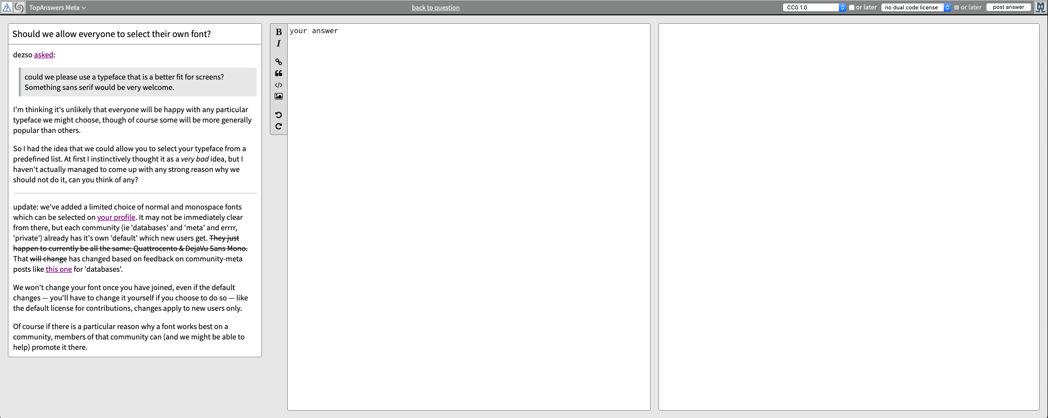
I just answered a question (my first time posting here), and this is the edit window I was presented with:
That is...not ideal. The question is hard to read, and I didn't even use the whole column so the extra space for entry and preview didn't help me. I get why this would be helpful for longer posts or for people who go full-screen with their browsers on huge monitors, but I can't do that. My current browser width is 1157px, which does not seem unreasonable. (It's wider than what would allow me to have browser and editor side by side, a not-infrequent desire. And it's almost as wide as my tablet can support full-screen.) Also, zoom makes this layout worse, and some of us need a little help there.
I don't have a concrete suggestion here. From SE I'm used to the preview being below rather than next to the edit window, but that does lead to undesirable scrolling sometimes. I don't know how well the side-by-side setup here would work with code, though. Maybe what I (someone who is pretty fluent in Markdown) want is for the preview to be smaller but *expandable*, so I can mostly ignore it and then check my work if I'm doing something tricky (or before posting).
Top Answer
James Douglas

We have now made the edit and post pages use a responsive layout:
Wide screen answer:
Medium screen answer:
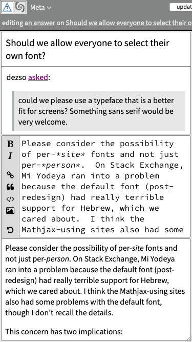
Small screen answer:
Additionally, these elements get zapped when the viewport is too small:

Answer #2
Caleb

These days assuming a wide screen by default is much better than assuming a narrow one. I _love_ the effective use of my screen real-estate using side panes like this.

That being said, I don't think the site should be making _any_ assumptions. Instead it should be adapting. Literally all major browsers these days have good support for flexible layouts (usually known as "responsive") that adapt to their shape and size. In this case I think the post compose screen should have a couple different modes and the overall available space would be used to select the best mode by default. When there is not realyl enough horizontal real-estate available, first the question and then the preview panes should revert to a verticle stacked layout.

When this works properly, everything from mobile devices to wrap around monster desk screens will be first class citizens.
Answer #3
Paul White

In other views, the border between the questions and answers pane and the associated chat room is movable.

This feature should be replicated so people can configure the layout to their own preferences when writing a question or an answer.
Answer #4
Jack Douglas

**Update:** now implemented, see [@James' answer](/meta?q=228#a892)

---

The new plan is to adapt the layout according to the viewport width.

I've moved this on to [to a GitHub issue](https://github.com/topanswers/topanswers/issues/12) so work can begin, and will update the post here when it is complete.